Anastasiya Razhkova

Product Designer

Boosting profits while building
user’s trust for your product

Product design
UX / UI
Branding
WARSAW, POLAND
©2024
B2B SaaS
user flow
usability tests
fintech

Noda

Designed a flow for generating invoices in PDF, QR code, and link formats from merchant to client. Created a management system with status tracking and resending options, ensuring security and scalability. Organised usability testing to iterate on design and save development resources.
B2B SaaS
user flow

Certifier

I designed the feature that allowed Certifier users to add custom email addresses for credential distribution to ensure branding and evoke trust. Optimized the process for over 10,000 organizations in total.
B2B SaaS
A/B tests
usability tests
metrics

Seturon

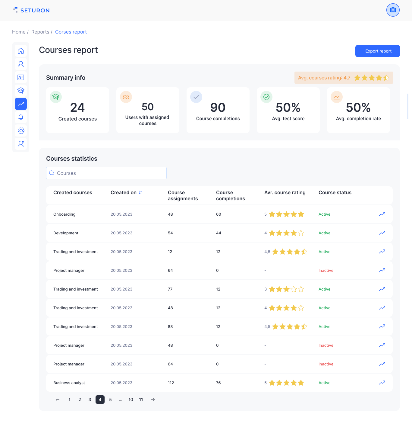
Joined the team as the 5th designer at the MVP stage. We were challenged to study the audience in a short timeframe, identify key patterns in learning and creative content creation and implement it in design solutions.
B2B e-com
metrics
IA
in-depth interviews

World e-Com

Designed and iterated on B2B e-com agency website through extensive benchmarking, usability testing; validated hypotheses and identified pain points through 9 in-depth interviews with sellers, identifying pain points. Through metrics analysis, implemented design changes which contributed to increased CR, AOV, LTV and Retention.
gamedev
user flow
metrics
hallway testing

PCF Playtests

At People Can Fly, I designed the playtests registration flow. By hallway testing and iterative improvements, I created a registration process that boosted CR and reduced drop-off rate.
finance
ux/ui
user flow
metrics

Samolet

Developed UX/UI for the registration stages of the mortgage savings product. Created the structure of user flow, designed screens for web and mobile, researched the auditory through 12 user interviews, validated prototypes through usability tests. The key product metrics for this project were CR to deposit opening and AOV.
travel
landing
brand identity
marketing design

Hug Camp

Led the project as the brand designer, overseeing the implementation of the brand across all digital platforms. This included creating a high-conversion landing page, designing digital marketing materials (such as banners and social media posts), and developing the logotype and overall brand identity.
marketing design
illustration
3d

And it’s not
even all...

Here you can a glimpse into some smaller projects that I’ve been working on/personal projects to show additional skills which I can utilise to boost your product.
close
People Can Fly
People Can Fly, established in 2002, is a global video game development company operating in Poland, the UK andNorth America. One of the leading Unreal Engine studiosin the industry.
As a publishing designer, I crafted high-quality promotional materials for IPs and corporate marketing. I developed the "Horde Mode" brand identity for Bulletstorm VR, created Figma templates to boost marketing assets quality, and designed 21 editable presentation decks and marketing materials for game stores and social media. I streamlined workflows by creating a UI Marketing Kit, improving efficiency for designers and non-designers.
Role
Digital Designer
Areas
AI, Marketing materials, 3D, Brand Identity
prototype

Problems

High workload and tight deadlines
A heavy workload and tight deadlines required efficient prioritization
Lack of brand identity and guidlines
Lacking a clear brand identity, designing for Bulletstorm and PCF felt like "building a plane mid-flight"— fast-paced and demanding adaptability
Maintaining quality with poor tools
Maintaining quality was challenging when using tools like PowerPoint, prioritized for non-designers' convenience and ability to edit content
Platform requirents
Finding a balance between creativity and meeting platform requirements, particularly Steam, can be challenging
Task from manager (no other materials were provided)
prototype
What I have delivered
prototype

Solutions & Results

Horde Mode identity
Created unique identity for “Bulletstorm VR” game mode reigniting interest in the product
Rebuilding the face of Bulletstorm
Boosting sales after a problematic launch by creating promotional materials which highlighted fixes, trailers’ slates, thumbnails, sales, etc.
Optimising design process
Optimizing the design process through Figma templates and  UI Marketing Kit streamlined workflows, reduced revisions & ensured brand consistency
Enchanced corporate communication
Over 10 newsletter designs achieving a 60% CTR increase in a year, 20+ design templates, and plenty of published marketing materials
prototype
close
PCF Playtests
People Can Fly, established in 2002, is a global video game development company operating in Poland, the UK andNorth America. One of the leading Unreal Engine studiosin the industry.
At People Can Fly, I was responsible for UX and UI of the playtest registration flow on web and mobile. Conducting 5 usability testing allowed me to refine the design pre-development, reducing costs. By leveraging user flows, and iterative improvements, I created a registration process with optimal CR to successful registration and minimized drop-off rate metrics.
Role
Digital Designer
Areas
UX/UI, Product Design
prototype
main_page
showcase

Goals & Challenges
Minimize the amount of screens
Create a registration process without overwhelming steps. Balance simplicity with necessary data collection.
Maximize CR
Increase successful completions by reducing friction and drop-offs. Use guidance and streamlined interactions.
Brand consistency
Align the design with People Can Fly’s identity across platforms. Adapt brand elements for web and mobile.
Create UI Kit basics
The lack of a PCF UI kit required me to create its basic elements during development.
prototype
main_page
showcase
card
card

Results

Strong CR (NDA)
The registration process was effective, achieving a high percentage of completed registrations
Low drop-off rate
The design minimized user frustration, leading to asmooth flow
prototype
prototype
close
Samolet
Samolet is the leading property developer in the CIS, with over 600,000 residents and 10.2 million square meters of housing delivered. The company covers every stage of development,from design to maintenance.
Designed the UX/UI for the registration flow of a mortgage savings product, focusing on user-centric solutions. Conducted 8 in-depth interviews to uncover user challenges and needs. Developed a comprehensive user flow structure, created responsive web and mobile screens, and validated the design through 12 usability tests to ensure a seamless user experience.
Role
UX/UI Designer
Areas
UX/UI, Product Design
prototype
main_page
showcase
showcase
showcase

Context

The platform seamlessly connects the financial tools of clients and partners, making home-buying process faster and simpler. This case study focuses onone of the key products born out of collaboration with a financial partner -a mortgage savings account. My role was to design and optimize the flow for opening this account, ensuring high CR and AFD (average first deposit), as well as smooth user experience.

Goals & Challenges

Minimize the amount of screens
Create a registration process without overwhelming steps. Balance simplicity with necessary data collection.
Maximize CR
Ensure CR to registration meets business requirements and constantly increasing (alongside with other several key metrics)
CJM
prototype

UX Tests

12 usability tests were essential in ensuring that savings account opening flow met TA expectations. These tests allowed us to identify roadblocks early in the design phase and iterate rapidly, creating a smoother experience for users before handling the prototype to developers.
prototype

Success metrics

Under NDA
Conversion Rate
Account Reopening Rate
Average First Deposit
close
Hug Camp
Hug Camp is a unique travel and adventure project based on the beautiful Madeira Island, offering a rich program of activities such as surfing, hiking, and yoga. The camp fosters a sense of community as participants share a house and create lasting connections while exploring the island's natural beauty.
I’ve designed a brand identity that reflects the spirit of community and exploration at the heart of the camp, making branding stand out from the competitors. My responsibilities also included creating templates for social media and high-conversion landing page that effectively communicated the program’s details.
Role
Visual Designer
Areas
Brand Identity, Marketing materials, UX/UI
prototype

Goals & Challenges

Creating a unique identity
Avoiding clichés while ensuring the brand stands out in a crowded travel and wellness market.
Conveying core values
Translating community, adventure, and wellness into clear visual elements.
Drive high conversions
Ensure interest in camp and drive high conversions to place reservation
Longevity of the design
Designing a brand identity that remains relevant as the project grows or evolves.
prototype
prototype
prototype

Results

Unique brand vision
Vivid identity that communicates the main values of the project
Metrics Analytics
Proper utilisation of CTA blocks and most complete information about the camp resulted in 18% of conversion to spot reservation
close
World e-Com
Full-circle e-commerce agency providing comprehensive omnichannel services to expand clients' operations into international markets. The company is based in Riga, Latvia and serves clients from 14 countries across 3 continents with a combined turnover of over €857 million.
As the sole product designer joining the company at the MVP stage, I was responsible for designing and optimizing the website through in-depth research and testing, as well as UI kit. This included conducting 18 interviews with sellers and 14 usability tests to identify pain points, analyze metrics, propose and test hypotheses.
Role
Product Designer
Areas
UX/UI, Product Design
prototype

Sellers problems

I conducted 18 in-depth interviews with business representatives from companies ranging in size from 4 to 500 employees. These sessions revealed key challenges entrepreneurs face when scaling into international markets.
Differences to the requirements of product cards
Problems with foreign logistics management
Higher commission compared to Cis markets
Absence of comprehensive turnkey business solutions.

Research

Usability test
Main page, Services
Metrics Analytics
Google Analystics, Aplitude
prototype

Key Metrics Results

+21% CR
Conversion rate to free consultation
+18% AOV
Average Order Value increase
+12% LTV
Lifetime Value
prototype
close
Seturon
Based in Luxembourg, Seturon is dedicated to transforming education through innovative technology. Company specializes in developing and implementing solutions that enhance learning effectiveness and accessibility, empowering learners globally to reach their full potential.
Joined the team as the 5th designer at the MVP stage. We were challenged to study the audience in a short timeframe, identify key patterns in learning and creative content creation. My main focus was on the home page of student dashboard. Additionally, I took a part in UI Kit development
Role
Mid UX Designer
Areas
UX/UI, Product Design
prototype

Context

Seturon is an EdTech based in Luxembourg. The company aims to transform education through innovative technology, self-created and marketed content, results tracking and student performance management.
USP
An adaptive learning platform that is user-friendly for students and administrators, with the ability to create content independently and tracklearning outcomes.
prototype

Preconditions

In 2022, the European EdTech market was valued at around €46 billion. The industry is forecast to grow by 15%
per year until 2028, reaching a value of €106.42 billion.
Context
Digital immaturity of educational organisations
Progress
Ongoing changes in the job market
Population growth
Increasing the average lifespan,and therefore the number of education cycles
The demand for educational content is growing
Growing demand for simple content creation and promotion
prototype
main_page
showcase

Monetization

Subscription
for B2B and B2C customers
Advertisement
for B2B and B2C customers
Freemium model
B2C
prototype
close
Meta Banners
for SurveyMonkey & Palta
SurveyMonkey is a global leader in online surveys and forms which provides answers to more than 20 million questions every day, helping organizations of all sizes build products people love, create winning marketing strategies, delight their customers, and cultivate an engaged and happy workforce.

Palta is a health & well-being technology company behind popular mobile apps like Flo, Simple and Zing.
prototype
main_page
showcase
card
card

3D Models

for PIN-UP, People Can Fly, personal projects
I have created multiple high-quality 3D models and renders tailored for business applications.
prototype
main_page
showcase
card

Illustrations

I posses skill of creating unique style digital illustrations that elevate branding and deliver a distinctive, standout visual identity
prototype
prototype
main_page
showcase
close
Noda
Noda is a SaaS fin-tech company serving over 5,000 small to medium-sized businesses. The platform simplifies financial operations by enabling users to generate invoices, track payments, and manage finances with ease.
The goal is to enable sellers, such as travel agents or businesses, to easily create and manage invoices for their customers. This flow have also to support multiple formats, including PDF, QR codes, and links, allowing sellers to choose the most convenient one (or several).
Role
UX/UI Designer
Areas
Fintech
prototype

Goals & Challenges

Minimize the amount of screens
Create a simple and efficient process for sellers to generate invoices for buyers in various formats (PDF, QR code, or link), as well as track statuses, and resend invoices, ensuring convenience in handling payments.
Maximize CR
Key challenges include designing an interface that is both flexible and user-friendly for sellers, supporting multiple invoice formats and clear inputs.

Benchmarking

I have analysed similar successful solutions - PayPal, Stripe, QuickBooks and Wise, which allow sellers to easily generate invoices in various formats and track their statuses. Since the technical task did not contain information about the necessary data for the invoice creation process, as well as the required inputs, it was decided to create blocks based on general knowledge about the Noda product, benchmarks and hypotheses.
prototype
prototype

Solutions & Results

Format flexibility
User don’t have to choose the only format - flow proposes all of them if needed, even after the invoice has been generated and sent
Maximize CR
Increase successful completions by reducing friction and drop-offs. Use guidance and streamlined interactions.
Brand consistency
Align the design with People Can Fly’s identity across platforms. Adapt brand elements for web and mobile.
Create UI Kit basics
The lack of a PCF UI kit required me to create its basic elements during development.
prototype

Success metrics

Conversion Rate
Abandonment rate
Abandonment rate
close
Certifier
Certifier is a SaaS platform that enables over 10,000 organizations to securely issue, manage, and verify digital certificates. With customizable and tamper-proof credentials, it simplifies the credentialing process for businesses and educational institutions, serving millions of certificates annually.
Certifier users need the ability to send emails from custom addresses for brand consistency and trust. The challenge was to design a simple and secure setup and verification process that ensures sender authenticity while keeping management intuitive and efficient.
Role
UX/UI Designer
Areas
UX/UI, Product Design
prototype

Goals & Challenges

Minimize the amount of screens
Provide an intuitive, secure, and clear process for users to easily add, verify, and manage custom email addresses for credential distribution
Maximize CR
Designing clear status indicators, simplifying the verification process, managing multiple verified senders - all that with the minimum amount of steps.

Benchmarking

I have analysed similar user flows in other SaaS services, such as Hotjar, Mailchimp, HubSpot assess their email verification processes, sender management, and user feedback clarity, and to implement the best practices.
prototype

Analysis

Key findings from SaaS platfroms benchmarking:
  • Clarity is crucial. Users have to understand the state of the email, if it was verified or not, what they are able to change, etc.
  • Fewer steps - better usability.
  • Immediate feedback matters. Clear CTAs and progress indicators are essential.
prototype

Success metrics

Conversion Rate
Average completion time
Abandonment rate